Adding or selecting a widget in Edit mode opens the Widget Properties inspector, which is divided into two sections: Widget Properties and Mapping.
Widget properties
The Widget properties section is divided into four tabs - General, MIDI, Value and Advanced.
General tab:

The number of options and their availability depend on the type of widget. The screenshot above shows available options for a button. We'll describe all the options below.
Customize caption - enable this toggle button to have the widget display a custom caption and then type in a new name. If this toggle button is disabled, the default caption is defined by the selected parameter name (refer to the Mapping section below for more information).
Note: if you add the "[value]" tag (without quotation marks) to your caption, then the parameter value will also be included in the caption:
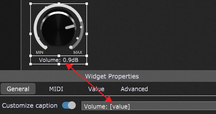
If you add the "[variation]" or "[rackspace]" tag (without quotation marks) to your caption, then the name of the corresponding variation or rackspace, respectively, will be included in the caption. Finally, if you add the "[notename]" tag (without quotation marks), then values from 0 to 127 will be converted to note names, from C2 to G8, respectively.
Another supported tag is "[nl]":
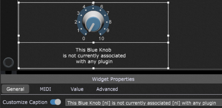
This tag allows you to add new lines in a widget caption. (see the example screenshot above)
Display range - this option applies to knobs and sliders and is enabled by default; when disabled, the widget doesn't show the ring around the outside of the knob or slider:
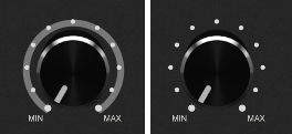
When this toggle button is enabled, you can notice two colors: the total range (dimmed) and the scaled widget value (brighter color).
Show value in caption - this option is disabled by default; when enabled, it overrides the defined caption and displays only the parameter value.
Momentary touch - Sustain pedal, Buttons and Switches include the Momentary touch option to control the momentary behavior on mouse clicks or touch. Disabling this property will keep the sustain pedal up or down until you click on it again. Enabling this property will keep the pedal pressed until you release the mouse click.
Lock - this feature allows you to lock a widget so that it cannot be adjusted using a computer mouse, touch screen or trackpad. Locked widgets have an overlay in the upper-left corner:
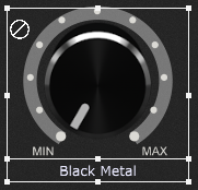
By default, this overlay is just displayed in Edit mode. If you want to show it always, turn on the Always indicate locked widgets toggle button in the Display Options.
Note: Label widgets are locked by default. If you unlock a label widget and map it to a plugin parameter (e.g. Channel 1-2 volume from an Audio Mixer plugin), then clicking on that label widget when you're not in Edit mode allows you to change the parameter value for that plugin:
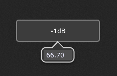
This way, it's easy to enter a specific value that you want a parameter to have and always set it to that value. Additionally, entering MIDI values is also supported so as to make it easy to set some parameter to a MIDI value - if a plugin supports program change as a host parameter, you could easily specify MIDI value 42m rather than having to turn a widget to find the value.
Widget link - each widget can only be associated with a single plugin parameter. However, the 26 widget link groups (from A-Z) enable you to control multiple parameters from any or all widgets assigned to that link group. Click on the dropdown list (right to the "Widget Link") and select a letter ranging from A to Z to assign a widget to that link group (e.g. "V"). All widgets with the same letter are linked together so that moving one widget will cause all the other widgets in that link group to move as well, adjusting various plugin parameters simultaneously:
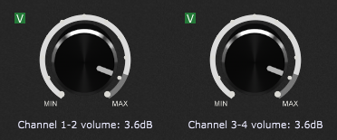
Note: each widget can have its own scale curve so that the actual values sent to the individual plugin parameters do not have to match. Check the How to add a widget to a Widget Link group chapter for more information. A widget cannot be a member of both radio group and a widget link group.
If you want the widget link and radio group labels to stay always, i.e. even if you are not in Edit mode, then turn on the Always show Widget Link and Radio Group labels toggle button in the Display Options.
Tip: Pressing a character (A-Z) while holding the Alt key (or Option on Mac) down will assign all selected widgets to that character's widget link group. Alternatively, select the desired widgets and add them to a link group using the Widget Contextual Menu.
Show back plate - this option is enabled by default on widgets that support it; when disabled, the "back plate" information such as numbers, Min/Max or an "on/off" legend is not displayed:
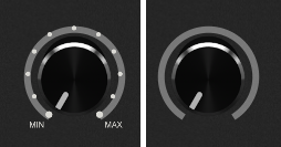
Note: this option is enabled only when you are editing a label, a knob, a toggle switch or a LED button.
Hide temporary value - when this toggle button is turned on, the parameter value is never displayed when a widget changes.
Hide - clicking this toggle button will hide the widget when Edit mode is inactive. Note: hidden widgets are semi-transparent in Edit mode for easier identification.
Radio group - allows you to group multiple widgets where only one widget in the group is turned on at a time. Supported widgets are buttons, LEDs, switches, and the Sustain pedal. You can define up to 99 radio groups. A widget cannot be a member of both radio group and a widget link group. To learn more about this feature, visit the chapter How to add a widget to a Radio Group.
Some widgets include the additional properties in the General tab; these are:
1. Shape widget - this widget includes additional properties: Fill Color, Outline Color, Roundness and Thickness (of the border):

Simply click on the corresponding buttons and then pick fill and outline colors (as well as their transparency).
2.Label widgets - these widgets (Text Label and Tape Label Horizontal/Vertical) include properties described in 1. plus additional properties:
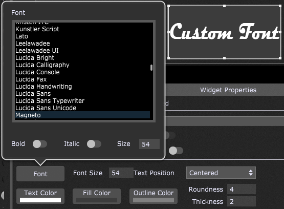
- Font - clicking on the Font button allows you to select the desired font, bold and italic styles and font size. By default, only Gig Performer standard fonts are listed; to allow the use of other fonts from your computer, turn on the Allow local fonts toggle in labels toggle button in the Display Options. Note: this feature is available in Gig Performer Pro.
- Font Size - allows you to select the desired font size between 4 and 256.
- Text Position - allows 9 text positions: Centered, Centered Left, Centered Right, Centered Top, Centered Bottom, Top Left, Top Right, Bottom Left, and Bottom Right alignment.
- Text Color - allows you to select the desired text color and the transparency.
MIDI tab:
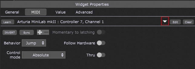
Learn button - click on this button to have Gig Performer learn the physical control you want to associate with the selected widget. When actively in Learn Mode, the button is lit red; to exit Learn Mode, click on it again, and it will return to its normal gray color. Refer to the How to connect a widget to a MIDI device chapter to learn more.
Note: the only CC messages that Gig Performer cannot learn are CC 0 and CC 32, as these two messages are reserved for bank selection.
Drop-down menu - in Gig Performer Pro, clicking this drop-down button (indicated with the red rectangle) opens a menu allowing you to select a MIDI control alias (defined in the Rig Manager). Check the How to use aliases chapter for more information.
Edit button - click on this button to manually associate a MIDI device, MIDI message type and other parameters (depending on the message type, e.g. Note, Channel, CC number) with the selected widget.
Clear button - click on this button to clear the current controller assignment.
Invert button - when turned on, the widget's behavior is reversed; for example, a switch or a button will cause a parameter to go to minimum when in the ON (lit) position, and vice versa.
Sync button - pressing this button engages bidirectional communication between Gig Performer and the controller mapped to the control.
Note: this feature is available in Gig Performer Pro.
This lets physical controls on control surfaces reflect changes executed in Gig Performer, and Gig Performer widgets show changes made on the physical control to which it is linked.
Controller polarity - displays the polarity (+ or -) for a controller. To invert the polarity of a MIDI controller such as a sustain pedal, first create a MIDI Control alias in the Rig Manager and set the desired polarity (click here and check point 15 d) to learn more). Afterward, select that MIDI control alias by clicking on the red rectangle (see the screenshot above). Note: this feature is available in Gig Performer Pro.
Momentary to latching - this toggle button is displayed only when editing switches, buttons, LEDs or a sustain pedal. When checked, the widget remains ON until you click on it (or touch the associated physical controller) a second time. This is useful when you want to have a widget carry out an operation until stopped, i.e. staying at a fast Leslie speed until you are ready to return to a slow Leslie speed.
Behavior - this drop-down menu allows you to choose between Jump and Catch modes. When a widget is in Jump mode, moving the associated physical controller will cause the widget to jump to the position of the controller immediately. When a widget is in Catch mode, the widget will not respond to the associated physical controller until the controller's value matches the widget's current value, at which point the widget will follow the controller. Note: if the Follow Hardware toggle button is turned on, this menu will change to Initial Behavior.
Follow Hardware - to enable this toggle button you must learn or manually assign a MIDI device and a CC message. This feature allows you to set a widget to the last seen value of the hardware (pedal, slider, knob, etc.) when you switch to the rackspace that contains this widget. When you turn on this toggle button, then:
- Ignore Variations toggle button in the Value tab will be hidden,
- Also Reset on Rackspace Activation toggle button in the Value tab will be hidden.
Control mode - allows you to set either absolute (default) or relative control mode for a widget. There are 4 different relative modes: Relative Offset, Signed 1 Bit, Signed Magnitude, and Two's Complement.
Note: If you previously selected a MIDI control alias (using the drop-down button indicated with the red rectangle), the Control mode is managed in the Rig Manager. Refer to the Rig Manager chapter to learn more about the Rig Manager and various control modes.
Thru - by default, this toggle button is turned off, so a MIDI message learned by a widget will not be forwarded to plugins. Turn on this toggle button to send out the learned MIDI message to plugins. For example, you can both play a note and have that note turn on your Leslie effect.
Value tab:
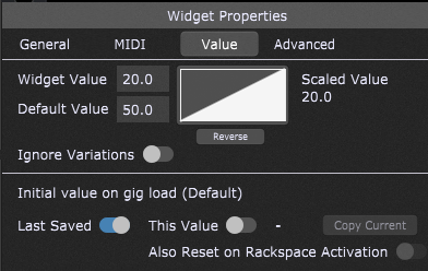
Widget value - each widget has a range of 0 to 100. Note that this is a percentage, not an absolute value. For example, suppose the plugin parameter it is controlling has an absolute range from 0.0 to 1.0. When the widget is at its "100" setting, it actually changes that parameter to 1.0 (i.e. 100% of 1.0). The value of widgets from the Buttons category (buttons, switches, and LEDs) can only be 0 or 100 - there is nothing in between, and the only values that a button can emit are the values at those positions. Anything in between will be ignored. You can also directly enter values using MIDI numbers by adding the letter "m" at the end of the value. For example, if you type in "64m", Gig Performer will interpret it as an exact value of 50.39 (roughly 50% of the maximum MIDI value of 127).
Default value - continuous widgets allow changing the default value; this value cannot be set on others. When you double-click on the widget (when not in Edit mode), the widget value is reset to the specified default value.
Scaled Value - this value is the actual value that is sent to the plugin parameter. The default scaling for a newly inserted widget is the same as the actual widget value, as shown by the triangle shape of the curve. Scaling is based on the defined curve; find out more about curves in the How to control the widget value scaling chapter.
Reverse button - inverts the current curve horizontally. For example, if your curve has a default linear shape where widget value 20 results in scaled value 20, clicking the Reverse button will scale the widget value 20 to be sent out as the value 80.
Ignore variations - this toggle button is turned off by default; when turned on, the selected widget will be excluded from variation changes and will remain at its current value. This is useful if you have, for example, several different variations that change the widget settings controlling effects such as phasing or flanging. Still, you want the widget controlling overall volume to remain constant. Note: if this widget is part of a radio group, turning on the Ignore variations toggle button will also apply to all widgets in the radio group. Also note that this toggle button will be hidden if the Follow Hardware toggle button is turned on in the MIDI tab.
Send scaled changes only - turning this toggle button on prevents widgets from sending out values if the new value would be the same as the previously sent value. This feature is intended, for example, to allow expression pedals to be used for switching to the next song. Next, in conjunction with the appropriate scaling, this mechanism also allows you to use continuous controllers in a stepped mode, effectively thinning incoming MIDI CC messages.
Send on Radio button off - this option is displayed only on widgets in a radio group; it allows you to send out the value when this (currently selected) widget turns off.
Initial value on gig load (variation_name) (not available in the Global rackspace) - Gig Performer by default restores all widgets to their last positions in variations when a gig file is saved (the Last saved toggle button will be enabled in this case).
You can, however, click on the This value toggle button to take a snapshot of the current position of the selected widget so that position gets recalled and loaded instead. This can be useful if you are playing, for example, a song where the volume of your piano always starts softly but gets quite loud by the end. When you come back to that song again, you don't want the piano to still be loud - you want it always to start soft. The concept is that, even if you play around with widgets during your live performance, your originally stored values will return when you next reload a gig file.
Click on the Copy Current button (it is enabled only when the "This value" toggle button is enabled) to take another snapshot of the current widget position.
Additionally, clicking the Also reset on rackspace activation toggle box resets the widget value to "This value" on the rackspace activation. Note that this toggle button will be hidden if the Follow Hardware toggle button is turned on in the MIDI tab.
Note: Widget values are always automatically saved and reloaded in your gig file per variation. Using the explicit load value, the current widget will be reset to a specific value when your gig loads, even if you change it later and save the gig file.
Advanced tab:
The features mentioned below are available in Gig Performer Pro.
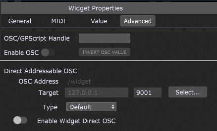
OSC/GPScript Handle - allows you to set a name for use in GPScript, OSC, Timeline and Song Part actions and Gig Performer extensions. To learn about handles in Gig Performer, see the blog article What is a handle and how to use it.
Enable OSC - click on this toggle button to make the OSC/GPScript Handle field available to OSC. For more information on OSC, click here.
Invert OSC value button - clicking on this button inverts the OSC value. Click again to revert.
Direct Addressable OSC (this section is only visible when the Enable Widget Direct OSC option is enabled in OSC Options and is intended for advanced control of remote devices):
•OSC Address - type in a valid OSC address of the remote device.
•Target - type in a valid target IP of the remote device and afterward type in the listening port of the remote device. Clicking the Select... button allows you to easily select an OSC target from the list that must be previously set in OSC Options.
•Type - allows you to set the type of the argument for an OSC message (Default, Float, Integer, and String).
•Enable Widget Direct OSC - clicking on this toggle button allows you to send out widget values as OSC messages for external processing. Note: OSC Address and Target must be defined to enable this toggle button.
Note: global widgets (widgets in the Global rackspace) have one additional setting - Global Parameter Assignment:

Refer to this chapter to learn how to use this setting.
Mapping section
The mapping section is used to connect widgets to plugin parameters:
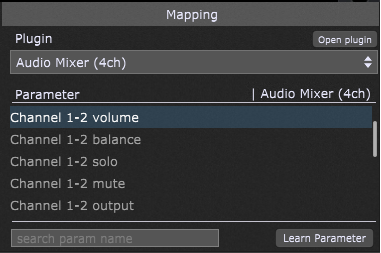
Plugin - click on this drop-down to view the list of plugins in the current rackspace, and then select the plugin you want the widget to control.
Open plugin button - click this button to open the editor for the selected plugin.
Parameter - parameters are displayed only when a plugin is selected; select the one from the list of available controllable parameters that you want to have the widget control. Alternatively, you can search the parameter name by typing a partial parameter name in the search param name search box or, even easier, use the Learn Parameter button.
Learn Parameter button - click this button to have Gig Performer learn the plugin parameter you want to associate with the widget. This button is displayed only when a plugin is selected. When in Learn Mode, the button is lit red; to exit Learn mode, click on it again, and it will return to its normal gray color.
Note: widget assignments to physical controllers in the Widget Properties area override the Global MIDI Options assignments.
Refer to the How to connect a widget to a plugin parameter chapter for more widget mapping and parameter learning information.